Create a custom-designed widget for your website that, when clicked, opens the campaign from the side or opens up as a popup
You can custom design a widget that appears in your website on the pages you specify. When a user clicks on the widget, the campaign opens up from the side and visitors can interact with it.
After clicking on the widget it either opens up from the side of the page or as a popup within the page.
How to create a widget in Adact gamification software?
Step 1: Create your campaign
You can use any campaign in the widget format.
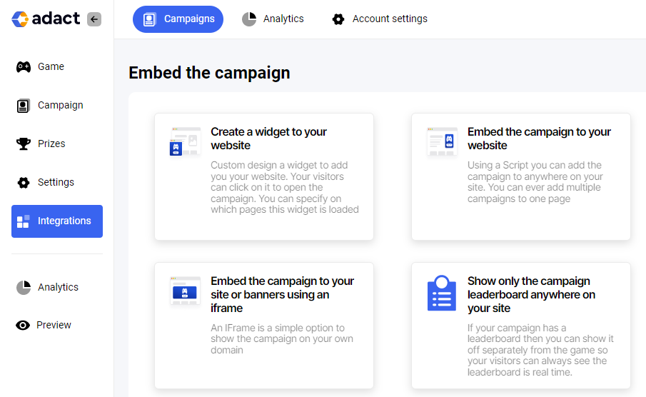
Step 2: Go to Integrations - "Create a widget to my site"
You can find the new option from the campaign editor left side.
Step 3: Edit the widget
You can edit many things about the widget to ensure your gamification marketing campaign is a success.
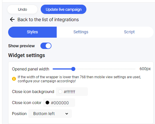
Editing Widget Settings
Opened Panel Width - Specifies how wide you want the panel to open. You can test it by clicking on the preview widget on the right - the panel opens up. By changing the width you can see the further impact for the panel.
Close Icon Background
After opening the widget there's a circle "X" button. This changes the close button background.
Close Icon Color
This changes the "X" text color shown on the Close button.
Changing the Widget Design
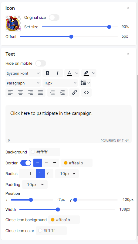
Changing the Icon
Equally important - you can upload any image to be show as the icon for the widget. Just upload the icon and either use its original size or drag the slider to make it larger or smaller.
Offset
You can hide a part of the icon to the edge of the screen to create even more unique design. Maybe use an image for example of a Wheel of Fortune but just show half of the wheel as an icon.
Changing the text
Text appears on top right of the icon.
You can edit the text as if you were editing a document in any text editor.
Hide on Mobile
This text will not be shown on Mobile. Sometimes the icon is enough and text would block out too much of the page.
Position
X - Move the text left or right from the icon.
Y - Move the text upwards / downwards from the icon.
Width - The textbox Area with
Close icon background - The color of the button from which the user can close the widget
Close Icon color - the color of the X inside the close icon
Widget Rules
You have the flexibility to customize the widget rules and determine the actions it takes when it's hidden or shown.
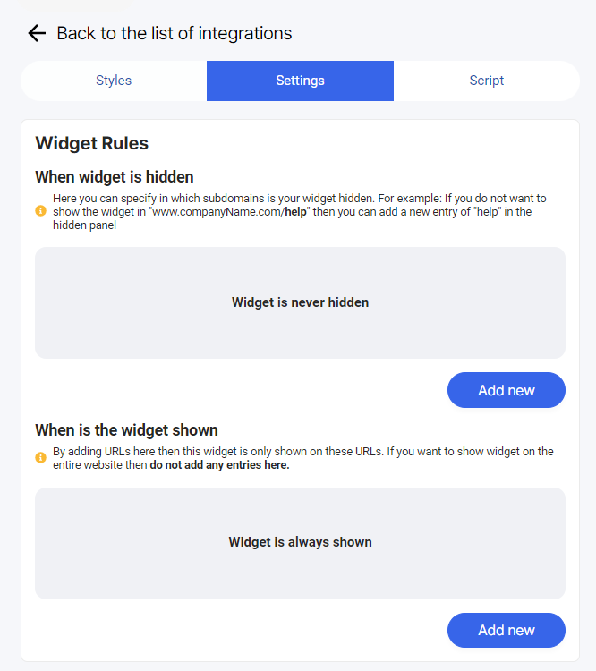
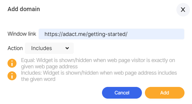
To get started, simply click on "Add new" and you can easily add your preferred settings:
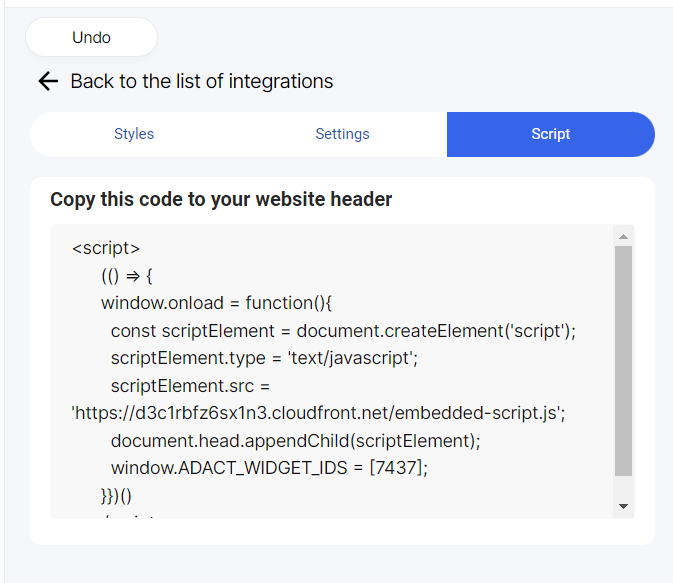
Adding widget to your website
In order to do that just copy this code to your website header:
