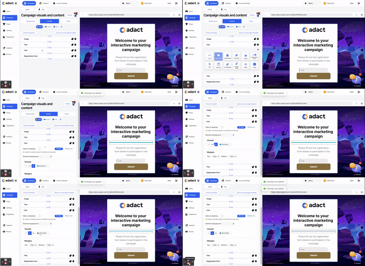
How to add a new element - Line? Read more about it in this article.
Adding a "line" element creates visual clarity, structural organization, professionalism, and branding. It simplifies scanning and draws attention to important areas, maintaining a consistent and engaging form for participants.
You can design added lines with different options:

Hide this element on PC - Makes it visible for mobile users only
Line weight - 3 different options to change the line weight (thin, medium, bold)
Change colours - Copy your brand’s colour code after to the colour box
Element margins - distance (in pixels) between the picture and the top or bottom of your element box border. Set the top and bottom element margins to 0px to remove the background from your line.
Background
Visuals
- Choose visuals by adding your own branded picture or logo and choose it's layout and position.
- Choose different color to stand out! You can use your brand's color and adjust the opacity to make it perfectly suited to your needs.
Border
- Border - You can display and design a border with different colors and sizes.
Paddings
- Incorporating paddings into your design makes it look better and work better. Choose top, bottom, left and right paddings to make your content easier to see!
Can I design PC and Mobile view separately?
Yes, we support different designs in PC and Mobile view. By clicking on Mobile view, you can design your campaign for mobile users in addition to PC users.
By default, you can leave the same design to Mobile view as in PC view. If you prefer a distinct design for Mobile, toggle off the "Use desktop design" option.
This way, you can effectively tailor the appearance of the "Line" to match the specific needs and aesthetics of your PC and Mobile users.
For exclusive display on either PC or Mobile:
Simply toggle on the "Hide on desktop/mobile" option according to your preference. This ensures the button appears only on the selected device.
